 RELATIONS AMONG LONG TERM TRENDS OF
PRODUCTIVITY , ECONOMIC GROWTH,
TRADE DEFICIT AND JOBS IN USA
by
Chih Kwan Chen
(June 30, 2004)
Abstract
The correlation between the long term trends of productivity gain and US
economic
growth is studied by stripping away wide gyrations due to the economic
booms and
busts from both sets of data. For the preglobalization era, a strong positive
correlation
is observed as expected. However, in the current globalization phase the
positive
correlation has changed to a negative one, implying that higher productivity
gain
rather induces slower economic growth. This surprising outcome is further
traced
down to the long term trend of increasing US trade deficit that undermines
the long
term potential of job creation due to both the forced automation and offshore
job
outsorcing in order for US domestic industries to compete with foreign
rivals.
1. Introduction
It is often claimed that the productivity
gain drives the economic growth. In this paper we will study the validity
of this claim. First of all we must know what are the "productivity gain"
and the "economic growth" mentioned in the phrase. Most people think that
they are just statistics released by the government every quarter. In the
next section we will show that the jumpy annual data (don't need to mention
the quarterly data) can not be reconciled with the claim that the productivity
gain drives the real GDP growth. Actually what we should study and the
opening claim is refering to are the long term trends of the rate of productivity
gain and the long term real GDP growth rate that are buried beneath the
widely gyrating annual data pushed around by economic ups and downs and
need a careful analysis to reveal.
Section 3 is devoted to the detailed
study of the long term trends of productivity gain rate and real GDP growth
rate, and the relation between those two data sets. During the preglobalization
era, that is, before Reagan era, there exists a strong positive correlation
between the two data sets. However, in the current globalization phase,
this positive correlation has turned into a negative one.
The surprising negative correlation
discovered in Section 3 is further analysed in Section 4. There is a strong
indication that the negative correlation is the result of long term trend
of expanding trade deficit that has damaged the long term potential of
the society of USA to create jobs and thus reducing the long term growth
potential of the economy.
2. Uncovering the long term trends of productivity gains
We start the analysis by listing
the mechanisms that can produce gyrations in the annual data of productivity
gain rate.
Mechanism 1: At the top of an economic boom, most people, including
corporate managers, are extremely optimistic about the
continuation of the economic boom. Corporate managers will hire large number
of workers to gear up their
production in order to meet the expected ever surging demands of their
products. Then the boom peaks out,
the growth of sales stagnate, and the productivity of corporations plunges.
When it becomes obvious to
most people that the peak of the economic boom has passed, corporate managers
will panick and start
to lay off workers. As the race between the layoff and the falling sales
heats up, the productivity gain rate will
arrest its sharp fall and eventually hits the bottom. As economy starts
to recover, most people, including the
corporate managers, will be skeptical, and the corporations will not start
to hire new workers. As sales pick
up, corporate managers will drive their bare bone work force to work to
full capacity to meet the surging
demand. Thus productivity will raise rapidly ahead of the real economic
recovery. This kind of gyrations in
productivity gain rate, if plotted on a graph, will look like preceeding
the graph of real GDP growth rate.
However, as is obvious from the explanation, it is the economic booms and
busts that are driving the gyrations
of this kind of productivity gain rate, not the other way around as required
in the phrase that the productivity
gain drives the economic growth.
Mechanism 2: As an economic boom proceeds, corporations will put their
idle capacity back to the production lines. The
natural way to do is to put the most efficient capacity among the idled
back to service first. Thus as economic
boom matures and the sales growth slows, so are the productivity gains.
When sales growth turns to negative,
capacities employed in the production lines need to be idled. This will
be done by idling the least efficient
capacity first. Thus as the sales growth turns to negative, the productivity
gains rate will turn to positive and
rises. The productivity gain curve from this mechanism also will lead the
curve of annual growth rate of real
GDP. From the explanation it should also be obvious that it is the economic
ups and downs that is driving this
mechanism of productivity gains, not the other way around as required in
the phrase.
Mechanism 3: During an economic expansion, corporate managers have a
natural tendency to want to invest in new
technologies to improve the efficiency of their productions. However, it
takes time to bring those new
technologies into real production, so the productivity gains from this
mechanism will lag behind the curve of the
annual growth rate of real GDP. The productivity gains of this mechanism
apparently can induce higher
economic growth in future and belongs to the category that we want to study.
There are other mechanisms of productivity gains, and they will be discussed
later in appropriate places since they will not cause wild gyrations in
the productivity gain curve.
Now let us look at the actual data
themselves. The annual growth rate of real GDP from 1949 to 2003 (Ref.
1) are plotted as red dots, the annual growth rate of productivity (Ref.
2) as blue dots, and the annual growth rate of nonfarm payroll employment
rate (Ref. 2) as green dots in Fig. 1 respectively. By a close inspection
of the red dots and the blue dots we will
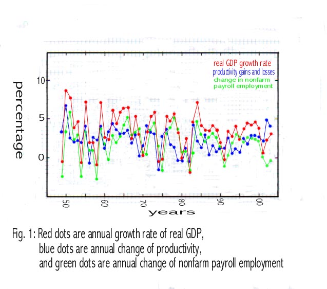
see that the blue curve has a tendency to fall first when the red curve
is still hanging on at the high ground. This is a clear indication that
the blue curve, the productivity gain, preceeds the red one, the real GDP
growth. This is an indication of the domination of Mechanisms 1 and 2 in
the gyrations of the productivity gain curve in Fig, 1as discussed above.
Thus we need to eliminate the wide gyrations present in Fig. 1 in order
to study the underlying long term trends of the data. The green curve,
the change of nonfarm payroll employment, keeps up well with the real GDP
growth rate, the red curve, except in the period after 1995; this discrepancy
will be discussed later.
The annual data of productivity
gain and real GDP growth rate are plotted in the style of a correlation
graph in
Fig. 2 (a). The correlation there is rather poor as expected. By taking
2 year moving averages of both data sets as in
Fig. 2(b), the positive correlation becomes unmistakable,
whereas gyrations from one data point to the next is reduced somewhat.
By going into 4 year moving averages as in Fig. 2(c), the positive correlation
is further improved.
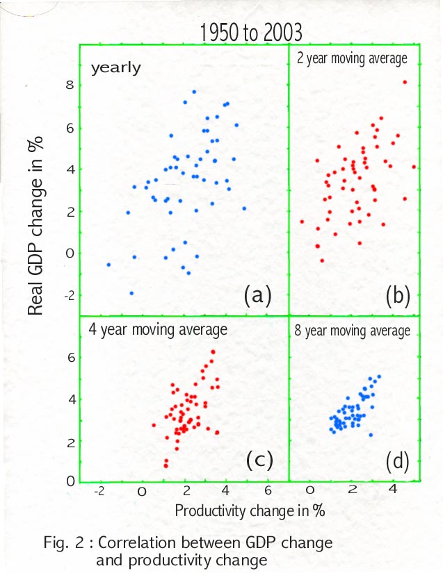
With 4 year moving averages the gyrations of both data sets, of course,
are reduced further. Average length of an economic cycle during 1949 to
2003 is longer than 4 years but shorter than 8 years. Thus the gyrations
in 4 year moving averages, that is not presented here, are still due the
ups and downs of economic cycles. To extract the underlying long term trends
buried beneath the economi cycles, correlations between 8 year moving averages
are shown in Fig. 2(d). In principle we can go even longer by taking more
than 8 year moving averages. However, if we go too long, all the resulting
data points will cluster around the center of the correlation graph and
nothing interesting will be revealed. We consider 8 year moving averages
as a good compromise and will regard 8 year moving averages of various
data sets as revealing their long term trends throughout the remainder
of the paper.
3. Correlations in the preglobalization and the globalization phases
To further analyse the long
term correlations between the productivity gain and the GDP growth, 8 year
moving average data sets are divided into two time periods, from 1956 to
1978 and from 1979 to 2003, and are plotted in Fig. 3. The
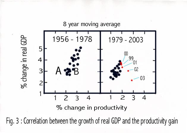
graph for the period from 1956 to 1978 shows a clear positive correlation.
We may confidentally conclude that the inovations in technology and the
opening up of new high productivity industries have steadily pushed up
economic growth during that period, and the quote at the beginning of this
article that productivity gain drives economic growth is really refering
to this kind of positive correlation between two data sets.
For the period from 1979 to 2003,
data points from 1979 to 1998 are plotted as black dots, and those of 1999
to 2003 as red dots. As for the black dots, though some kind of positive
correlation still exists, the range of productivity gain becomes much narrower,
from 1% to 2%, compared to the previous period where productivity gains
ranged from 2% to 3%, and consquently the average economic growth is also
lower than the previous period. If superposed on the graph of the period
from 1956 to 1978, black dots in the period of 1979 to 1998 fall into the
region labeled as "A". The productivity gain in the period from 1999 to
2003 has accelerated, but the correlation with the economic growth has
turned into a negative correlation. This means that higher productivity
gain rather has induced lower economic growth; this is totally in contradiction
to the starting phrase to proclaim that productivity gain drives economic
growth. It should be noted that the data points in Fig. 3 are all 8 year
moving averages, thus the data point of 1999 is rather measuring the condition
centered around the year of 1995. The red data points showing the surprising
negative correlation centered around the period of the latter half of 1990's,
supposedly the era of PC and internet. In the next section
we will analyse the cause of this surprising negative correlation revealed
here.
4. The cause of the negative correlation
The most desirable productivity
gain is due to the emergence of highly efficient new industries; this kind
of productivity gain will add to employment and will contribute to economic
growth. The automation of an existing, but rapidly expanding industry will
not cause the loss of jobs so it will also contribute to economic growth.
The automation of a matured industry will result in layoffs; with the total
sales stagnating with or without the automation and less employment as
the consequence of the automation, this kind of productivity gain will
reduce jobs and thus hurt the economic growth. Then there are a kind of
forced automation; a struggling industry undergoes automation to compete
with imported goods manufactured in low labor cost countries. This type
of automation will result in massive layoffs and will definitely hurt the
economic growth.
Besides automation, productivity
will change by moving manufacturing facilities out of the country whereas
moving the facilities within a country from a high wage area to a low wage
area will not change the productivity. To explain this statement, let us
consider the following example: XYZ Co. sales its products to consumers
so that its annual sale of 1 billion dollars is directly tabulated into
GDP as the final sales. It employes 1000 workers, 900 in the manufacturing
facility and 100 in the headquarter. Its manufacturing facility is in a
high wage area. The expenses of XYZ Co. are as follows: 300 million dollars
a year is for the buying of raw material used in the production. To simplify
the argument here, let us assume that all the 300 million dollar raw material
are imported from overseas. The labor cost for the manufacturing is 500
million dollars a year, the expenditure of the headquarter is 100 million
dollars a year, and the profit of XYZ Co. is 100 million dollars a year.
The contribution of XYZ Co. to GDP is 700 million dollars a year since
300 million dollars of imports for the raw material must be subtracted
as net import from its total final sales of 1 billion dollars. Thus the
productivity of XYZ Co. is 700 million dollars divided by 1000 workers,
that is $700,000/worker/per year. Now suppose it lays off 900 factory workers,
move the manufacturing facility to a low wage area within the same country,
rehire 900 workers in the new area, and consequently reduces the labor
cost for manufacturing by 100 million dollars a year. Also let us assume
that XYZ Co. keeps the price of its procducts steady. Thus the profit of
XYZ Co. doubles to 200 million dollars a year. Now for the productivity,
the contribution of XYZ Co. to the final sales category of GDP is still
700 million dollars a year, and the number of workers is still 1000, so
the productivity of XYZ Co. does not change. Suppose XYZ Co. outsources
its manufacturing facility to a developing nation. The labor cost in the
new host country is now only 200 million dollars a year. Suppose that XYZ
Co. still keeps the price of its products at the same level. The profit
of XYZ Co. becomes 400 million dollars a year. How about its productivity?
Since XYZ Co. must reimport 500 million dollar worth of products to be
sold to the consumers in this country, its contribution to GDP is reduced
to 1 billion dollars - 500 million dollars = 500 million dollars. Its domestic
workforce consists of 100 workers in the headquarter, so its productivity
is now 500 million dollars divided by 100 workers = 5 million dollars/worker/year.
Thus the productivity of XYZ Co. jumps almost 7 folds by just moving its
manufacturing facility outside of the country.
As clear from the above discussion
we suspect that it is the run away trade deficit that is boosting the productivity
by forcing many struggling domestic industries into automation in order
to compete with inexpensive imports and inducing many to outsource their
not very high tech manufacturing facilities to low labor cost countries;
this kind of activity, though boost productivity sharply, will erode the
long term job creation potential of this country and thus reduces the long
term economic growth as we observed in the red dots of Fig. 3. To confirm
this suspicion, 8 year moving averages of the ratio of merchandise trade
deficit over nominal GDP are plotted versus 8 year moving averages of the
productivity gain in Fig. 4. Various periods are plotted with
different colors. The blue dots are for the period from 1957 to 1969;
during this period USA had a merchandise trade surplus about 1 % of GDP,
and the productivity gains scattered around from 2% to 3%, indicating the
lack of correlation between those two data sets. Red dots are from 1970
to 1983. There is a broad trend that larger the trade deficit, lower the
productivity gain. However, a close inspection reveals that the red dots
are grouped into three clusters and with two huge gaps separating the clusters.
Two gaps between the clusters of red dots correspond to two energy crises.
When oil price jumps, trade deficit will explode. However, trade deficit
expansion due to commodity price jump will hurt the economy and lower the
productivity gains, not like the trade deficit based on the manufactured
goods that will in general boost consumption and stimulate economic growth
(Ref. 3 and 4 ). The black dots are for the period from 1984 to 2003;
a strong correlation between the rising productivity and the expanding
trade deficit is clearly displayed. Most of the black dots not labeled
correspond to black dots of the section 1979 to 2003 of Fig. 3. The black
dots from 2000 to 2003 correspond to red dots in Fig.3 and are the ones
forming the negative correlation between the long term productivity gain
and the long term economic growth. The points after 2000 are showing a
much stronger correlation between the productivity gain and the expansion
of the merchandise trade deficit.
In Fig. 5, 8 year moving
averages of yearly changes in nonfarm business payroll employment are plotted
against 8 year moving averages of the ratio between the merchandise trade
deficit and the nominal GDP. Various periods are tagged with different
colors and with explicit labellings. Here we direct the attention only
to the blue dots labeled from 97 to 03.
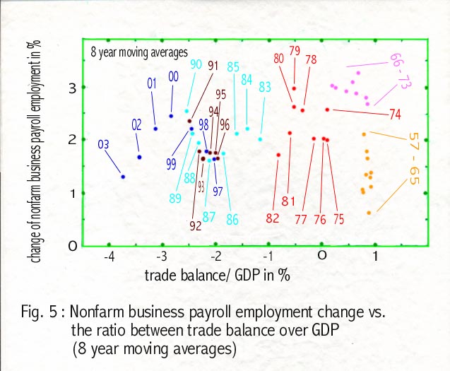
At first within the period of blue dots the rise of productivity and
the rise of job creation potential went hand in hand, indicating that the
opening up of new industries, that is, reflecting the proliferation of
PC and the emergence of internet society, has created many new jobs more
than compensating the job loss due to the steadily expanding merchandise
trade deficit. However, as 8 year moving averages of trade deficit ratio
moves above 3% of GDP, the erosion of job creation power is clearly
displayed. In calculating 8 year moving average of the coming dot of 2004
we need to subtract the number of jobs created in 1996 and add the number
of jobs created in 2004 to the sum of jobs from 1996 to 2003. In 1996 totally
2.4 million jobs were created. If the jobs created in 2004 is less than
2.4 million, then the job creation ratio will certainly drop further. On
the other hand the trade deficit ratio will move toward 5%. This means
that the 2004 dot will slide down the curve toward the lower left corner
further. Considering the numbers of jobs created in 1997, 1998, 1999 and
2000 are all around 3 million, the slide down of future blue dots along
the curve toward the lower left corner of Fig. 5 will probably continue
for quite a while.
4. Conclusion
The observed negative correlation
between the long term trend of productivity gain and that of economic growth
in recent years is traced down to the rapidly expanding merchandise trade
deficit of USA. The run away trade deficit is causing the rapid rise of
the long term productivity gain through forced automation and offshore
job outsourcing, but is steadily eroding the long term job creation potential
of the society and is causing the decline of the potential of the long
term economic growth.
References
1. Bureau of Labor Statistics
2. Bureau of Economic Analysis
3. Article No. 1 posted on this
website
4. Article No. 2 posted on this
website